Customer Service
John Lim
Customize Your Metrics: Make Every Dashboard Speak Your Brand's Language

Every restaurant brand measures guest experience a little differently. Your OSAT might be calculated the way most companies calculate NPS. Your team might track a complaints ratio no other brand uses. The metrics that matter to you have names, formulas, and formats that are specific to how your business runs.
Until now, Momos showed you its version of those metrics, not yours. Which meant someone on your team has to spend time reconciling the data with your internal KPIs. However, now you can close that gap yourself.
Why we built it
We kept hearing the same thing from enterprise teams: the data is right, but the labels don't match what’s being said internally.
A dashboard that says "NPS" when your company reports "OSAT" creates friction every time it's shared. Analysts rebuild exports to match the internal KPI deck. HQ teams second-guess numbers that don't line up with their glossary. This can result in operators tuning out a metric they don't recognize, which can eventually lead to missed opportunities to improve operations and reduce incidents.
There’s too much guesswork, and it's the opposite of what good analytics should do. The whole point of a dashboard is to move people to action, not the other way around. So we’re now giving you control of the labels, the order, and the format.
What it does
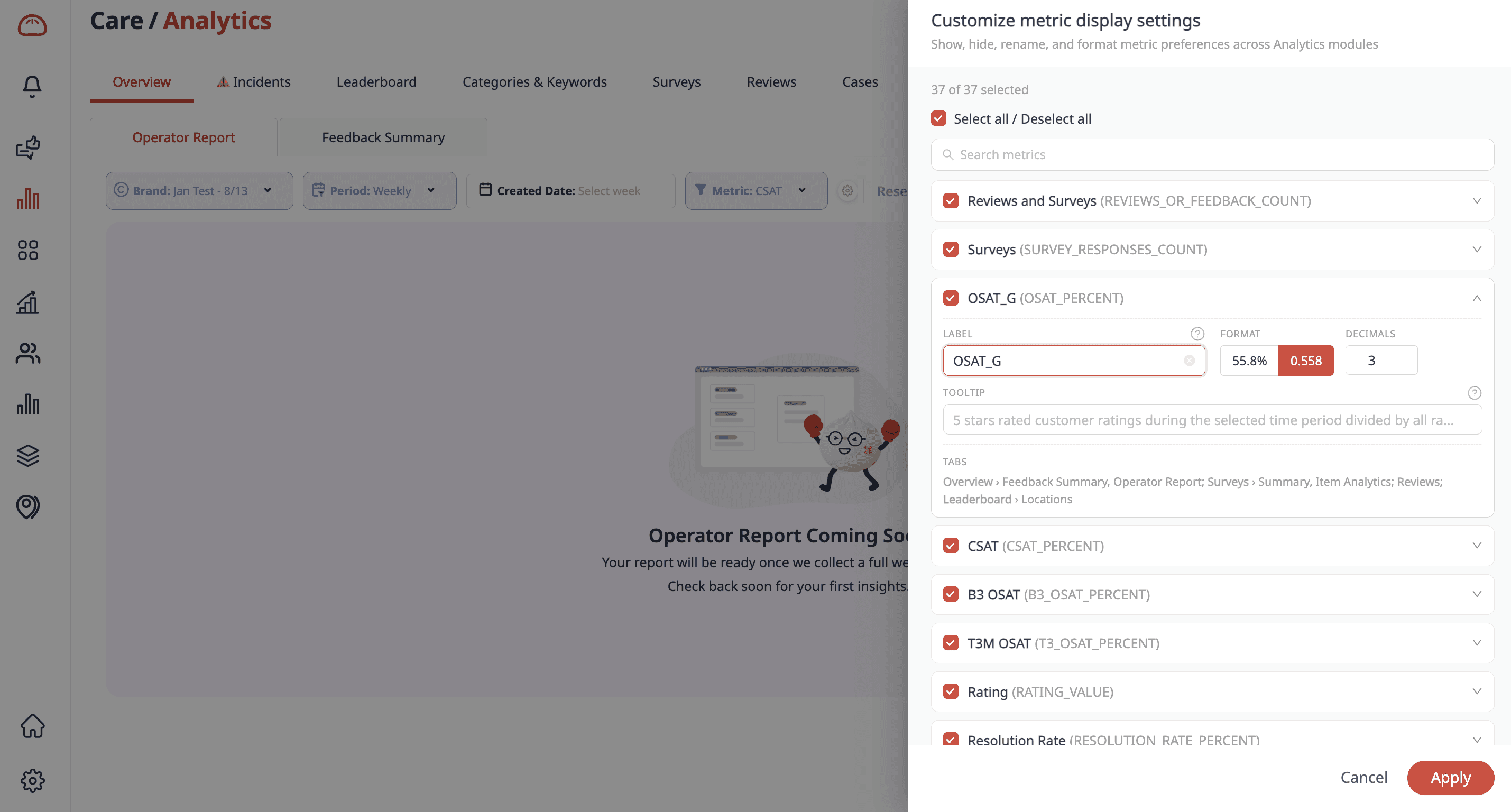
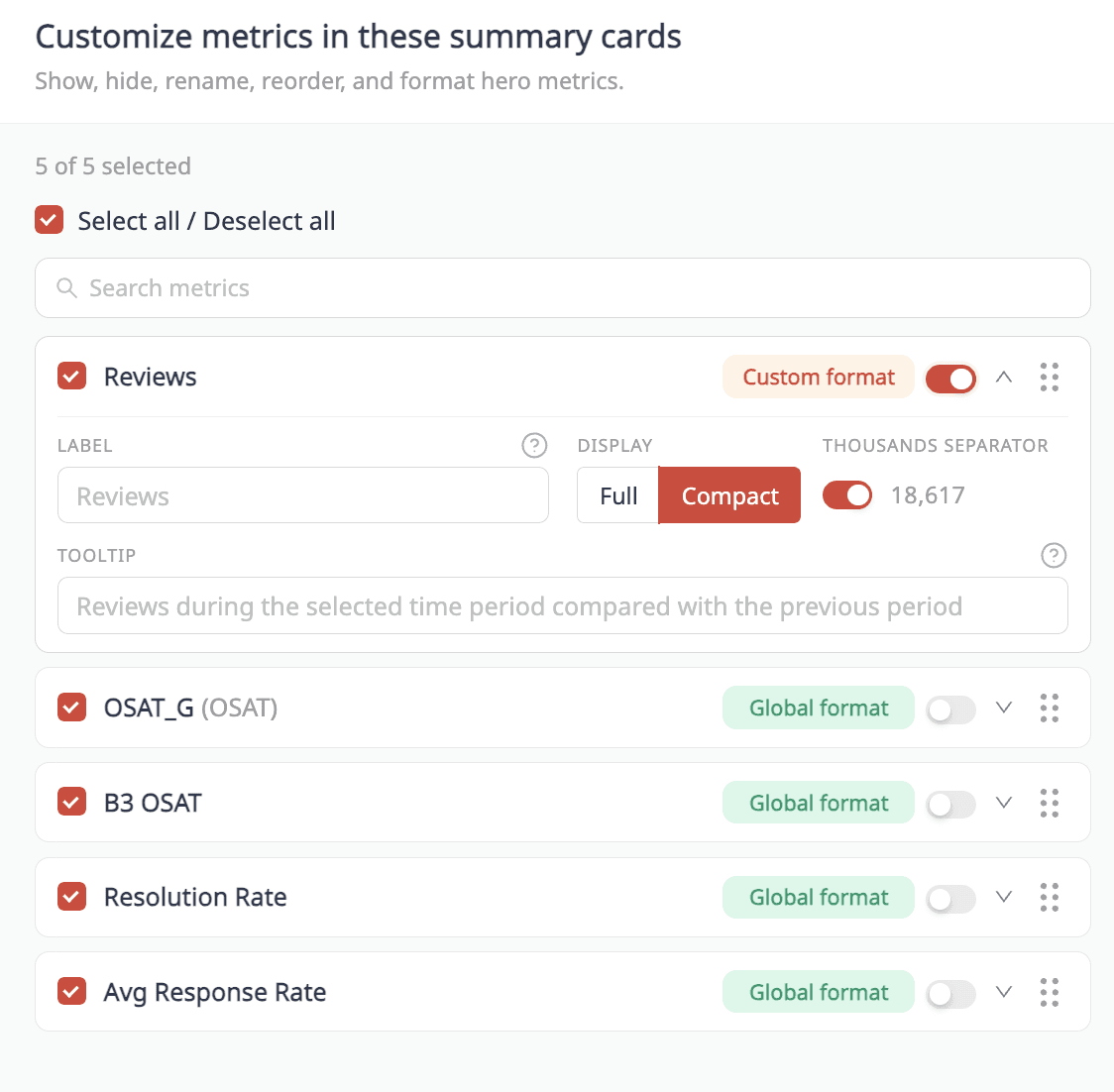
You can control the metrics shown across your analytics: the Operator Report, Location Leaderboard, Surveys, and daily email summaries. Specifically, you can:
Choose which metrics lead. Pick the metrics that matter most to your brand and push them to the top. The first one becomes the hero metric on your Operator Report and the number your team sees first.
Rename anything. Call a metric what your team calls it. NPS becomes OSAT. CSAT becomes whatever your glossary says. The definition stays consistent; the name matches your world.
Define what it means. Write a description for any metric, and it shows up as a tooltip wherever that metric appears. So when someone hovers on "OSAT," they read your definition of it. Not a guess.
Set the format. Whole numbers, percentages, decimal precision, compact or full, controlled per metric and per view.
Hide the noise. Turn off metrics your team doesn't use so each dashboard shows only what's relevant.
Apply it your way. Make a change for a single dashboard, or set it once across your entire account so every team sees the same vocabulary.
Here's what that looks like in practice. Say your brand reports guest sentiment as "OSAT," but on the platform that’s labelled as NPS. You rename it once to “OSAT”, push it to the top of your Operator Report, and set it to display as a whole number. From that point on, every operator, every regional manager, and every HQ report shows "OSAT".
What it means for your team
For HQ analytics teams: Reports are personalized to your data and ready to share immediately.
For operators: The data on the screen uses words your operators already know.
For CX leadership: Every location, every dashboard, every email reflects one consistent vocabulary.
How to get started
Setup takes minutes. Open your analytics settings, choose your metrics, rename and reorder them, and set your formats; every change previews in real time as you make it. Decide whether each change applies to a single dashboard or to your whole account, then save.
If you'd rather see it first, the 2-minute walkthrough covers the specifics end-to-end.


" transform="translate(3.219 19.212)" width="152.45224485148515px"/><path d="M 0 11.619 C 7.071 11.39 33.491 21.738 40.35 21.268 C 38.499 18.19 37.116 14.915 35.507 11.625 C 33.7 7.867 32.587 3.926 31.702 0" fill="transparent" height="21.28391189647101px" id="I9fuJaf7q" stroke-dasharray="" stroke-linecap="round" stroke-linejoin="round" stroke-width="4.97" stroke="rgb(0, 0, 0)" transform="translate(139.727 55.754)" width="40.34950693069311px"/></svg>)